Welcome to the part-1 of “Using KNIME for Data Analytics”. In this blog, we are going to learn how to use KNIME tool step-by-step for Data Visualization and in the next blog we will discuss how to implement Machine Learning models in KNIME.
KNIME: The KONSTANZ INFORMATION MINER
KNIME is a free and open-source Data Science tool that enables easy integration of new algorithms, data manipulation or visualization methods as a combination of nodes. A node is the smallest processing unit in KNIME which can be added easily with just drag and drop from the Node Repository. Each node has a specific single task assigned to it.
Nodes can be connected to each other through the input and output ports to form a workflow. More than 1000 nodes are available in Nodes Repository. Each node has a traffic light that represents the node state (three colors red, yellow or green).
Data Visualization in KNIME
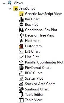
In the KNIME base version, there are many visualization nodes like a bar chart, box plot, Histogram, Scatter Plot, Line Plot, ROC Curve, etc.

Steps for Data Visualization:
First of all, create a new Workflow.
Go to File -> New -> Select New KNIME Workflow
Click Next and then click Finish to create an empty workflow
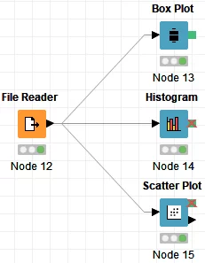
Next under Node Repository go to IO -> Read and select File Reader. Download this file mileage_new.csv. Right-click on File Reader node, select Configure, browse and select the above file and click OK. Execute the File Reader node.
Box Plot
In order to know the distribution (shape), central value, variation, outliers of a variable we use a boxplot.
We will use the following steps to create a boxplot.
Histogram
To get an idea of the distribution, skewness, outliers of a continuous variable we use a histogram. The values are grouped into bins to create the histogram. The height of the bars shows the frequency/density of the measurement range.
Now let us quickly create a histogram.
Scatter Plot
Scatter plot is used to get a visual idea of the relationship between two continuous variables.

So we have discussed how to plot different graphs in KNIME. There are other nodes as well which we have not used like Bar Chart, Line Plot, Heatmap etc. You can give it a try and share your views in the comment section on your experience of using KNIME.
