Data Visualization is the first step for any analytic project. It helps to understand the patterns, trends, and correlations present in the data. The insights gained from the visualization can be further used to create the statistical/ machine learning models. R has various libraries and functions for data visualization, and one of the libraries available in R is plotly.
Plotly with R:
Plotly is an R package, used for creating interactive web-based graphs via the open source JavaScript graphing library plotly.js. The charts made with plotly in R are interactive, can be zoomed over, designed and presented the way the user wants. The feature of zooming is not offered by either the ggplot2 package or the base R function plot().
Installation:
Plotly can be simply fetched from CRAN, using the below code.
install.packages(“plotly”)
library(plotly)
Plotly Uses:
Plotly’s R graphing library makes interactive, publication-quality graphs. Some of the charts which plotly makes quite easily are: line plots, scatter plots, area charts, bar charts, error bars, box plots, histograms, heatmaps, subplots, multiple-axes, and 3D (WebGL based) charts.
Charts and Graphs with Plotly in R
All the codes to plot start with plot_ly() in R.
Bar Charts:
Basic Bar Chart:
In order to create a basic bar chart that shows the frequencies (either absolute or relative) for a categorical variable (having different categories) the code is:
p <- plot_ly(
x = c(“apple”, “mango”, “banana”),
y = c(20, 14, 23),
type = “bar”
)
In the x-axis we have different fruits bought by a household and y-axis gives the number of each fruit purchased. The type actually tells the function what kind of graph is to be displayed for the given data (here bar chart).
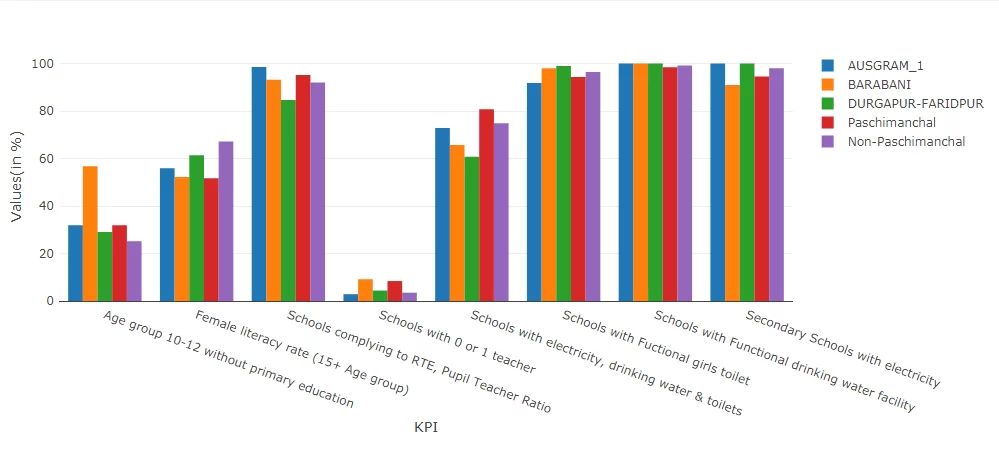
For Grouped bar charts we can add ‘trace’ to the bar chart. The number of traces added depends on the number of groups that the data has. Like we see in the chart below (made with plotly) each category has 5 different groups, thus we would require 4 traces in addition to the first bar that is plotted.
p <- plot_ly(data, x = ~category[x-axis], y = ~first_group[y-axis], type = ‘bar’, name = ‘category name[1]’) %>%
add_trace(y = ~second_group[y-axis], name = ‘category name[2]’) %>%
layout(yaxis = list(title = ‘Values’), barmode = ‘group’)
The command in layout, barmode=’group’ defines that a grouped bar chart is to be made. If in case a stacked bar chart is required in place of a grouped bar chart, the definition of x-axis and y-axis remains the same, but the barcode then becomes, ‘stack’
Box Plots:
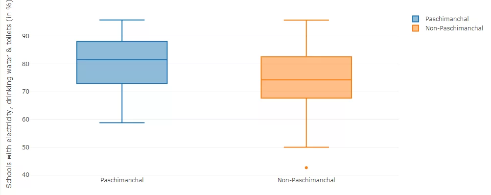
Plotly allows making boxplots, single or grouped. The boxplot shows the statistical summary in the form of minimum, first quartile (values below which 25% of data lies), median (value below which 50% of the data lies), 3rd quartile (value below which 75%) of the lies and the maximum value.
p <- plot_ly(y = ~variable, type = “box”)
Thus, we can look at the distribution of a particular variable by defining it in y=~variable. In case a horizontal boxplot is required, just in place of y, the values have to be given in x=~variable. The boxplot below has two groups, so in the code above, we can do an add_trace to add one more boxplot. It is similar to the bar chart, just that the type will be “box”, instead of “bar”.
In order to make a grouped boxplot the code is:
p <- plot_ly(data_frame, y = ~variable, color = ~categories, type = “box”)
Scatter Plot:
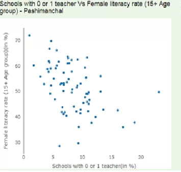
A scatter plot shows the relation between two continuous variables. In plotly the code for scatter plot is
p <- plot_ly(data = df, x = ~x_variable, y = ~y_variable)
All the charts made with plotly provides the feature to zoom in and out, while also allowing the user to customize the charts the way they want, by removing the grid lines, changing the color of the graph, providing the marker values as required over the chart. All of these features make plotly extremely useful package in R for data visualization.
Line Plots:
Line Plots are generally used to see the trend in time series data. The code for it in plotly is:
We can have multiple traces, but for all of them, the x-axis should have the same values. An example is shown below having two traces.
#Preparing the Data
trace_0 <- rnorm(100, mean = 5)
trace_1 <- rnorm(100, mean = 0)
x <- c(1:100) #denoting time periods
data <- data.frame(x, trace_0, trace_1)
#Plotting the graph
p <- plot_ly(data, x = ~x) %>%
add_trace(y = ~trace_0, name = ‘trace 0’,mode = ‘lines’) %>%
add_trace(y = ~trace_1, name = ‘trace 1’, mode = ‘lines+markers’)
Have you done visualization in R? Share us your views in comments.
Data Analytics with R Training at Data Brio Academy helps you gain expertise on the most popular Analytics tool – R. In this training you will learn how to use R, from beginner basics to advanced techniques, with live projects and assignments taught by industry experts. To enroll in R programming course and to be a data scientist and master R programmer just click the below link and submit your details. https://databrio.com/business-analytics


