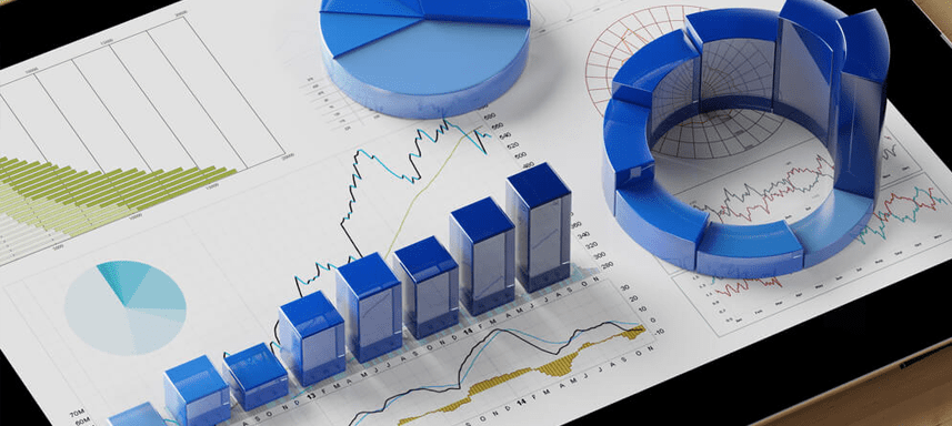
Charts and graphs are essential tools for data visualization. They are used to present data in a clear and concise way, and communicate insights from data. Charts and tables are used widely to create reports. These are integral part of data visualization, visual reports and attractive data dashboards as they present data in attractive and engaging ways to business users. Exploratory data analysis (EDA) is an essential step in the data science process, and charts are a valuable tool for EDA. They help in EDA by identifying and displaying insights and patterns in data. In this article, we will discuss about some popular and useful chart types and when to use those to augment our analysis as part of an analytic dashboard or a data science project.

You may follow 3 principles of data visualisation to create compelling visualizations and present your insights to your audience. There are many tools used for data visualization and analytics like PowerBI, Tableau, SAS Visual Analytics and many open source tools like Python, R etc. – what we discuss here is tool agnostic and would apply to all tools.
Guidelines on when to use which chart for data visualization and analytics:
- Pie charts: Pie charts are best used to show the relative sizes of parts of a whole or share of individual categories to the whole. Pie charts should be done with 5 categories or less, else the chart becomes too cluttered. Pie charts are not the best for comparing values between categories, because it can be hard to tell which slice is bigger when they’re close together. If you’re trying to compare values between categories, a bar chart or line chart might be a better choice than a pie chart.
- Bar charts : Bar charts are a great way to show how different categories compare to each other. They can be used to show data about anything, from the number of people who like different types of music to the sales of different products. They can be used for both categorical and quantitative data. Bar charts are also a good choice if you have a lot of data to show, because they can be easily scanned and interpreted.
- Clustered bar charts: Clustered bar charts are a variation of bar charts that are used to compare values between multiple categories. They’re like regular bar charts, but the bars for each category are grouped together. This makes it easier to compare the values within each category, like how many people like different types of music or how many employees work in different departments in a company.
- Stacked bar charts: Stacked bar charts are another variation of bar charts, but they are used to show the contribution of each category to a total value. The bars for each category are stacked on top of each other, which makes it easy to see how each category contributes to the total. For example, you could use a stacked bar chart to show how much each department in a company contributes to the company’s overall revenue.
- Line charts: Line charts are best used to show trends over time. They’re like a regular graph, but the points are connected with lines. This makes it easy to see how values change over time, like how much the temperature has changed over the past year or how much a company’s revenue has grown over the past five years. Line charts can be used for both categorical and quantitative data. The time dimension is displayed on x-axis in a line chart.
- Area chart : An area chart is a type of chart that uses areas to represent data. The areas are filled in, which makes it easy to see the changes in values over time. Area charts are often used to show trends or patterns in data. The x-axis represents the time or other variable. The y-axis represents the value. The areas represent the data. Area charts can be used to visualize a variety of data types, including time series data, categorical data, and quantitative data. Area charts are not good for visualizing small changes in data. In cases when small change over time needs to be displayed, a line chart is better option. Then there are some charts which are used as part of statistical analysis. These are included to display and communicate data in analytics dashboard where the users have some technical expertise and interested in having deeper view of data and analysis.
- Scatter plots: Scatter plots are used to show the relationship between two variables. The variables are plotted on the x-axis and y-axis, and the points on the plot show the values of the two variables for each data point. For example, you could use a scatter plot to show the relationship between the number of hours students study and their grades. Scatter plots can be used to show a variety of relationships, such as positive correlation, negative correlation, and no correlation.
- Histograms: Histograms are used to show the distribution of data. They’re like a bar chart, but the bars are connected together. They are a good choice for showing how frequently different values occur in a dataset. Histograms can be used for both categorical and quantitative data. For example, you could use a histogram to show the distribution of rainfall in a city or the distribution of scores on a test.
- Box plots: Box plots are used to show the distribution of data, similar to histograms. However, box plots also show the median, first quartile, and third quartile of the data. This makes it easy to see how the data is distributed and to identify outliers. Box plots can be used for both ordinal, interval and ratio data. For example, you could use a box plot to show the distribution of salaries in a company or the distribution of product performance feedback in a class.
All of the above charts are great tools for visualizing data and used commonly in a dashboard, but they are used for different purposes. If you want to show trends over time, a line chart is a good choice. If you want to show the relationship between two variables, a scatter plot is a good choice. If you want to show the distribution of data, a histogram or box plot is a good choice.
Then there are Treemaps and heat maps which are two different types of data visualizations that can be used to show how data is distributed.
- Treemaps : Treemaps are a type of visualization that uses nested rectangles to show the size of different categories of data. The size of each rectangle represents the value of the category it represents. Treemaps are a good way to show the distribution of data across different levels of a hierarchy. For example, you could use a treemap to show the distribution of sales by product category, by region, and by salesperson.
- Heat maps : Heat maps are a type of visualization that uses colors to show the distribution of data. The intensity of the color represents the value of the data. Heat maps are a good way to show how data is distributed across a continuous range of values. For example, you could use a heat map to show the distribution of rainfall across a city or the population density across a country.
If you want to show the distribution of data across different levels of a hierarchy, a treemap is a good choice. If you want to show how data is distributed across a continuous range of values, a heat map is a better choice. We will now discuss about a few other chart types that enhances analysis and dashboard in analytics and data science project.
- Bubble charts : Bubble charts are a type of data visualization that uses bubbles to represent data. The size of the bubble represents the value of the data, and the color of the bubble can represent another variable. Bubble charts are a good way to show relationships between three or more variables. For example, you could use a bubble chart to show the relationship between the size of a company, its revenue, and its number of employees.
- Radar charts : Radar charts are a type of data visualization that uses rays to represent data. The length of each ray represents the value of the data for a specific variable. Radar charts are a good way to show multiple values for the same data point. For example, you could use a radar chart to show the performance of a company on different financial metrics, such as revenue, profit, and market share.
- Waterfall chart : A waterfall chart is a type of chart that shows the cumulative change in a value over time. It is a good way to show how a final value is reached by adding or subtracting intermediate values. Waterfall charts are often used in accounting and finance to show how a company’s profits or losses are calculated. They can also be used to highlight specific changes in the value, such as positive or negative changes – the colors of the columns like green and red are used to indicate the type of change. You could use a waterfall chart to show how the number of customers has changed over time for a store – how many increased, how many churned, how many customers are buying more, how many buying less etc. and use it in your data visualization.
You may use any tool of your choice for creating your data visualization and analytics with PowerBI, Tableau, SAS Visual Analytics, Microstrategy or python, R or Julia, however, there are some basic points that you need to follow. In general, it is best to use the simplest chart that will effectively communicate your data. Here are some additional tips for choosing the right chart:
- Consider the type of data you are visualizing. Some charts are better suited for categorical data, while others are better suited for continuous data.
- Consider the number of data points you have. Some charts can become cluttered if you have a lot of data points.
- Add caption in chart always; use clear and concise labels for your axes and data points.
- Use consistent formatting throughout your visualization.
By following these guidelines, you can apply data analytics framework, choose the right chart for your data visualization and create effective and informative visualizations and dashborads. A good dashboard is an essential component of a data science project as it helps present and display the outcome of exploratory data analysis and many model outputs as well like sales forecasting, customer segmentation models, risk analytics models.