Overview
Exploratory Data Analysis (EDA) is an important step in the analysis of data in any data analytics and data science project. The main objectives of EDA are:
- Understanding the variable types and suitable mathematical aggregations. Understanding the underlying structure of the data.
- Analysing the data to gain meaningful insights and analytics; filter and drill down to find unique trends and behaviour to capture relevant insights from the data.
- Visualizing the data through suitable charts to capture interesting and meaningful insights from the dataset and presenting the analytics to users and, creating a visual dashboard/report with the key insights.
- Selecting the appropriate advanced analytics methods like mathematical or machine learning algorithms based on initial data exploration findings
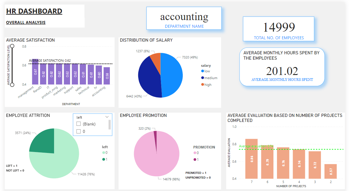
I have created the following data visualizations for overall analysis as part of HR Employee Dashboard in Power BI based on EDA.
Selecting Suitable charts for data visualization:
- For data visualisation of categorical variable, stacked columns, pie charts, donut charts can be used to display the count or distinct count of the variables or show contribution of parts to the whole.
- For numerical variables, we can use stacked columns, histograms, clustered bar charts, clustered column charts, line charts and can show the average or sum of the variables. Scatter plots can also be used for numerical variables to capture the relationship between two continuous variables.
- Boxplots can be used to see the distribution of the data where the variable is continuous or ordinal. If there is a categorical variable then it can categorize them into groups and compare the distribution of the variable for those categories.
- For binary variables, we can use bar charts, stacked columns, pie charts, donut charts and can find the distinct count or count of the variables.
Data Description :
As part of my data science internship I worked on a project for HR function using data science. In this HR Analytics project, I worked with HR employee data which had different features related to the employees of an organization like name of the employee, department name, satisfaction level, last evaluation, promotion, salary level, work left, work accident, number of projects done, average monthly hours spent etc.
Approach:
Step-1: Data Understanding
I created a data dictionary and developed an understanding of the overall data and variable types. For the given HR employee data, there were numerical, continuous, categorical and binary data types. Data understanding and identification of variable types are the crucial first steps in any data science project by interacting with the functional team at the organization.
Step-2: Data Visualization
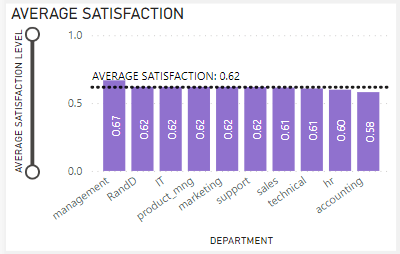
Visualizing the overall data through suitable charts as a whole is important for capturing meaningful insights, analytics from the data and understanding the overall distribution and relationships between the variables for further analysis. For data visualization, I used various charts suitable to the data types. Here, I found that satisfaction level was different for few departments out of 10 departments.
Step-3: Capturing Insights
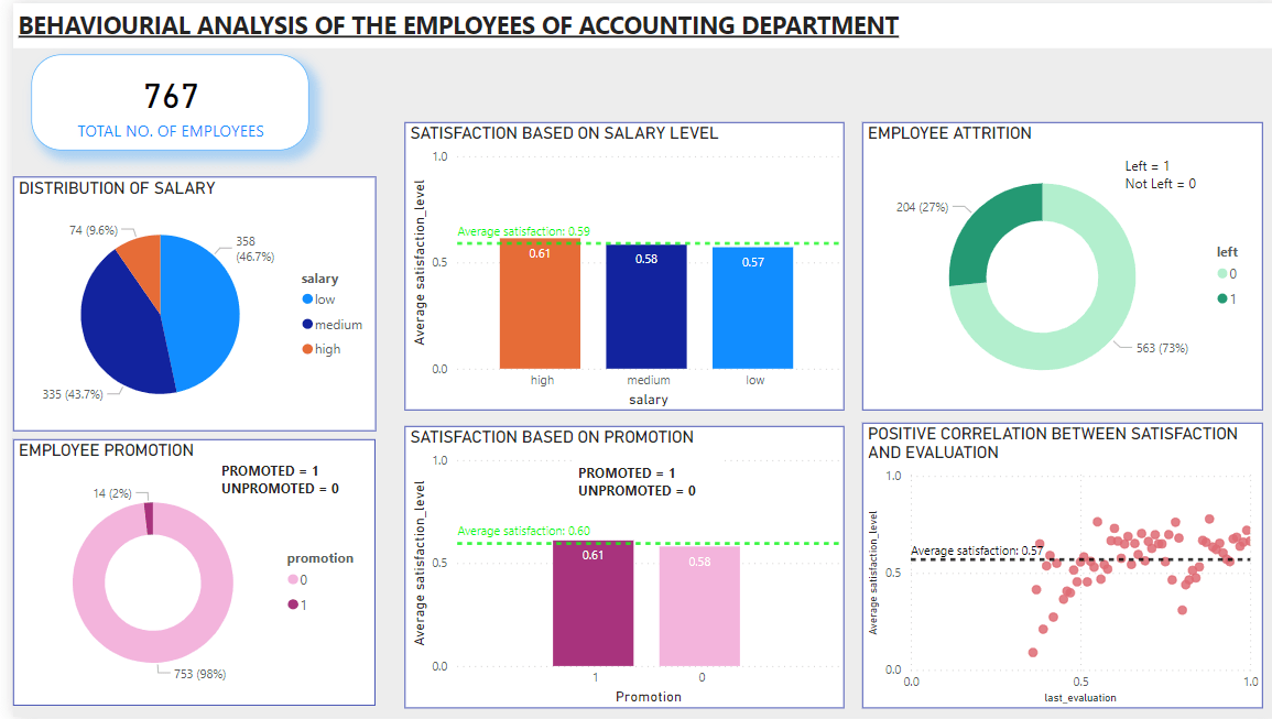
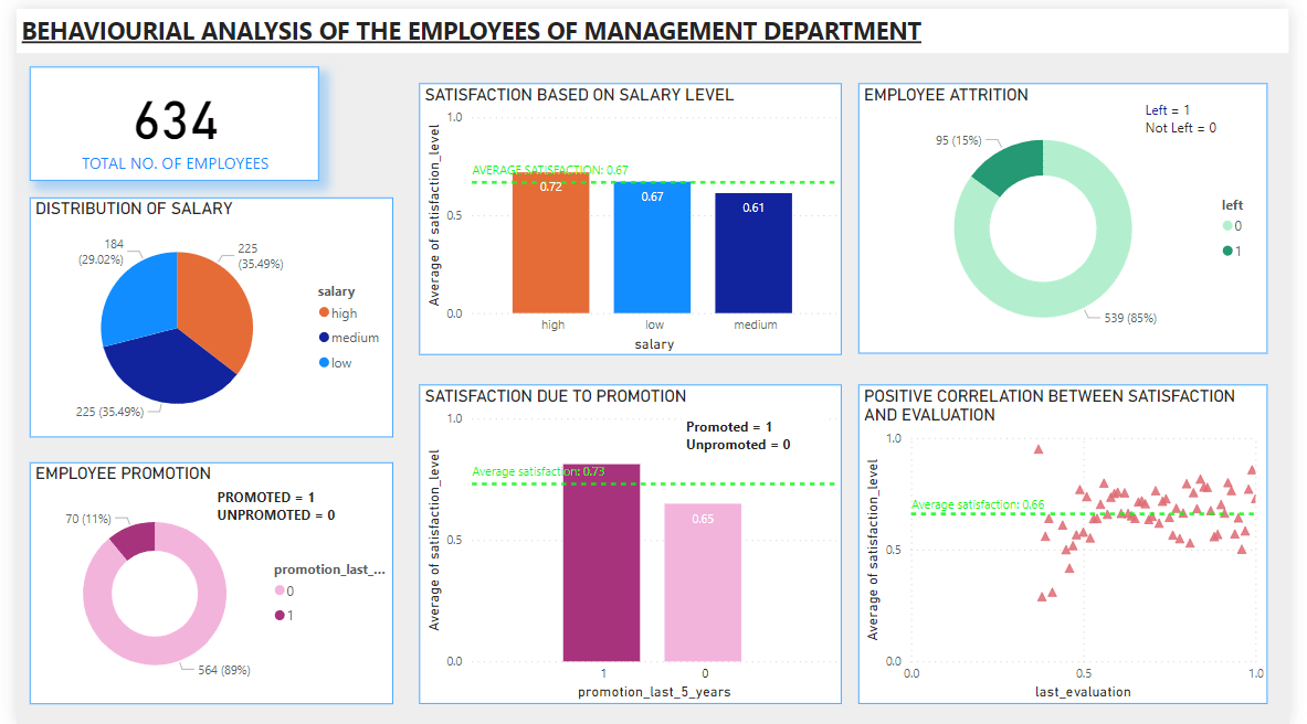
Average satisfaction level is 0.62 but the accounting department’s satisfaction level is below the average level (0.58) and it is also comparatively lower than other departments whereas management department’s satisfaction level is comparatively higher (0.67). Now, we will further deep dive into the data to gain underlying reasons for such differences in the levels of satisfaction.
Step-4: Feature Selection
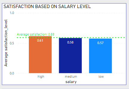
Deciding the relevant features that is related to the problem (different satisfaction levels) is important. We need to understand the factors that can be responsible for high or low satisfaction levels by selecting the most relevant features like salary level, promotion, last evaluation. For example, the below visual is showing the analytics of distribution of salary level based on satisfaction level of accounting department.
Step-5: Data Transformation
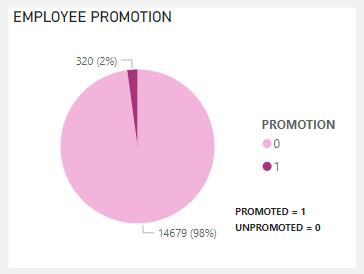
If required, we can transform the data such as modifying the columns to meet the needs of the concerned analysis. For example, the visual shown below, we have the promotion column in binary 0 and 1, we can convert this column by replacing 1 as promoted and 0 as unpromoted which will make the visual simpler to interpret.
Key Insights:
Accounting Department’s visualization and dashboard based on satisfaction level:
Possible causes for low satisfaction can be due to:
- Salary Level, as we can observe that fewer number of employees (74 out of 767 i.e. about 10%) are paid high salary.
- Employee attrition, as we observe that it is higher (27%) than the overall employee attrition (24%).
- Promotion, we can see only 2% or only 14 out of 767 employees got promoted in the last 5 years.
- Average satisfaction based on last evaluation is also comparatively lower.
- Correlation measures the strength and direction of relationship between two variables. There is a positive correlation between satisfaction level and last evaluation.
Management Department’s Visualization & Dashboard Based On Satisfaction Level :
Possible causes for high satisfaction can be due to:
- Salary Level, as we can observe that 29% or 184 out of 634 employees are paid high which is greater than the overall percentage of high paid employees (8%)
- Employee attrition, as we can observe it is lower (15%) than the overall employee attrition (24%).
- Promotion, we can observe that 11% or 70 out of 634 employees got promoted in the last 5 years which is greater than the overall promotion of the employees (2%).
- Average satisfaction based on last evaluation is also comparatively higher. Also there is a positive correlation between the two.
Summary
I performed EDA – exploratory data analysis (including descriptive statistics) by utilizing various tables and charts to analyze and visualize different types of variables effectively. This helped in deriving meaningful insights from the employee data. With this knowledge, I can now create insightful dashboards and reports tailored for businesses. Any project involving data must adhere to a structure. For this project, I followed a structured methodology that started with data understanding, data cleaning & data transformation, feature selection, followed by data analysis and data visualisation in Power BI tool and, finally created the HR employee interactive dashboard. The exploratory data analysis (EDA) and the dashboard also laid the foundation for further investigation aimed at identifying the causes through the use of inferential analytics and machine learning algorithms.
About the author : Jigisha Basu is a student of Data Science course at Data Brio Academy. She wrote this article based on her project during her summer internship while pursuing her masters degree (MSc. In data science) from Amity University.

