The Pareto Principle is commonly used in any exploratory data analysis, report or dashboard. Pareto principle is named after Italian civil engineer, economist, and sociologist Vilfredo Pareto. Vilfredo Pareto observed that about 80% of Italy’s land is owned by 20% of the population.
The Pareto chart, a powerful data visualization tool for dashboards, combines bars and a line graph to reveal the “vital few” factors contributing to the “trivial many” outcomes. Imagine a customer service dashboard. The bars, in descending order, represent different complaint categories. The line shows the cumulative percentage of issues each category contributes. At a glance, you see which complaints account for most problems (the 80% in the 20/80 rule), allowing you to prioritize solutions and optimize resources. This visual clarity makes Pareto charts a valuable asset for data-driven decision making.
What is Pareto Principle?
Pareto principle is known as the 80-20 rule. It asserts that 80% of outcomes or outputs result from 20% of all causes or inputs for any given event. 80% of revenue for an ecommerce portal comes from 20% of the products it carries. One can argue that for losing weight one can eat nutritious food 80 percent of the time and indulge in less healthy food for the remaining 20 percent of meals!
What is Pareto chart?
A Pareto plot is essentially a sorted bar chart in descending order that shows the cumulative total via a line. While drawing a Pareto chart, cumulative values are calculated from the base values of the variable and then % cumulative is calculated. Pareto charts are widely used as part of analytics and data science dashboard. It is also a commonly used visual tool in Six Sigma methodology to identify vital few inputs or top 20% causes contributing to maximum failures (80% of outputs) in a process. In data science dashboard for marketing function, Pareto may be used to find the top 20% partners/affiliates contributing to 80% of sales for an organization.
How to draw Pareto Chart?
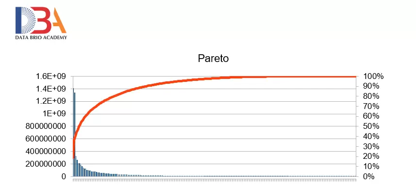
Lets take an example of population of countries – there are 2 columns named Population and Country Name in dataset named country. We shall first sort the countries on Population in descending order. Then we shall calculate a new column called Cumulative Percentage. (You may calculate an intermediate column for cumulative population and then calculate cumulative percentage from there). The table below shows a partial data of dataset – country.
| Country | Population | Cumulative Percentage |
|---|---|---|
| China [a] | 1409517397 | 18.64% |
| India | 1339180127 | 36.35% |
| United States | 324459463 | 40.64% |
| Indonesia | 263991379 | 44.13% |
| Brazil | 209288278 | 46.90% |
| Pakistan | 207990876 | 49.65% |
| Nigeria | 190886311 | 52.18% |
| Bangladesh | 164669751 | 54.36% |
Pareto chart is a combination of bar and line chart. So Population will be plotted in bar chart and Cumulative population will be in line chart.

The above chart shows that 20% of countries contribute to 80% of population of the world.
Pareto in Dashboard
Tableau – The Pareto chart can be drawn in Tableau. Refer for detailed steps –https://help.tableau.com/current/pro/desktop/en-us/pareto.htm
Excel – In Microsoft Excel in recent versions, there is an option called Pareto in chart option. Refer for detailed steps https://support.microsoft.com/en-us/office/create-a-pareto-chart-a1512496-6dba-4743-9ab1-df5012972856
Python – Pareto distribution and chart can be drawn in python using either Scipy.stats library or NumPy or matplotlib library.
Pareto principle and Pareto chart is widely used in analytics dashboard and Machine Learning as part of exploratory analytics.