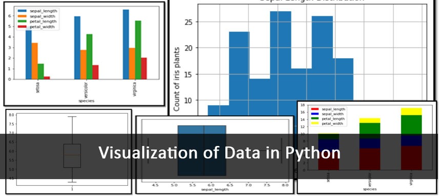
We have already discussed data visualizations in python and saw how to create histogram, boxplot, barcharts and line charts in part 1 of the blog. Continuing the discussion we will further discuss about other chart types like Scatter Plot, Bubble Plot and Heat Maps – their implementation in python.
Scatter Plot and Bubble Plot
Scatter Plots are used to understand the relationship between continuous variables. These plots can also be used to draw best fit lines. A variation of Scatter Plot is the Bubble Plot, where an additional size variable is added.
Creating Scatter and Bubble Plot in Python
The dataset used here is the car_crashes data from the seaborn package.
import seaborn as sns
df3 = sns.load_dataset(“car_crashes”)
plt.scatter(y = df3[‘speeding’], x = df3[‘alcohol’])
#Creating scatter plot to see relationship between speeding and alcohol which are variables in a car accident dataset
plt.ylabel(“Speeding”)
plt.xlabel(“Alcohol”)
plt.show()
Bubble Plot
Here we have added the not distracted factor as the size of the bubbles.
plt.scatter(y = df3[‘speeding’], x = df3[‘alcohol’], s = df3[‘not_distracted’]) #Adding a size factor from the “not distracted” variable

Scatter Plot between speeding and alcohol

Bubble Plot with “not distracted” as the size factor (notice how the sizes are different?)
Heat Map
Heat Maps use colors to represent numbers in data. There are different colors for different ‘heat levels’, hence showing the transition from lowest to mid-ranged and to highest values.
Creating a Heat Map in Python
import seaborn as sns
df1 = sns.load_dataset(‘flights’) #loading “flight” dataset
result = df1.pivot(index = ‘year’, columns = ‘month’, values = ‘passengers’)
In order to create a heat map, we are creating a pivoted data frame, with the rows as the years and the columns as the months and the values as the number of passengers that avail flights in the respective year and month
sns.heatmap(result, annot = True, fmt = “g”) #creating a heatmap, setting annotations to true.
The annotations show the values as labels by default and are thus set as true. Also, we set the fmt parameter as “g” so that the output annotations are in string format.
plt.show()

Heat Map showing the number of passengers availing flights
Python hosts numerous data visualization techniques. The ones mentioned in this and the previous part of the blog are few of the more commonly used techniques. Data Visualization is the first step before performing any analytic algorithm. To get any kind of information, insight or information from real data, data visualization is a must.
Data Science with Python certification course at Data Brio Academy helps you gain expertise on the most popular programming language “Python”. In this training you will learn how to use Python in analytics & data science projects, from beginner basics to advanced techniques, with live projects and assignments taught by industry experts. To enroll in Python programming course just click the below link and submit your details. https://databrio.com/