R language allows to do charts, plots and visualizations in multiple ways as part of a data science or AI project. Basic functions are available in R for plotting. There are also specific charting libraries like ggplot2, plotly etc. that can be used to make beautiful and improved charts and visualizations. In this blog let us look at different ways of creating histogram in R and how it is used to analyze data and make inferences.
Creating a Histogram in R
Histogram is a frequency plot of a continuous variable and shows how a variable is distributed. Histogram is often used as part of exploratory analytics i.e. initial stages of data analysis and also while presenting findings as part of a dashboard in a data science or machine learning project. Histograms are also widely used as a visual tool to identify possible problem areas based on the data distribution.
For doing a basic histogram in R, hist() function can be used. Additional parameters like col for color, xlab, ylab for adding labels etc. can easily be added. Let us check the example below. We are using cap.csv file which has the variables Torque and Machine where Torque is a continuous variable and Machine is a categorical variable. We will also look at the code for creating a histogram with ggplot2 library.
Histogram with hist() function in R
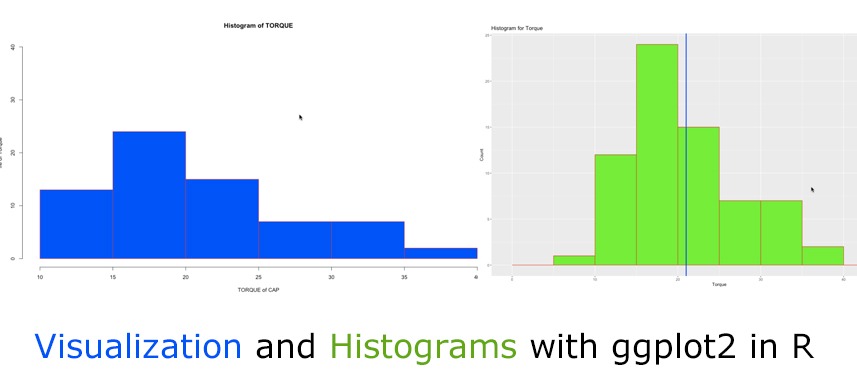
hist(cap$Torque, col = “green”, border =”red”,main = “Histogram of TORQUE”, xlab = “TORQUE of CAP”, ylab=”Frequency of Torque”, ylim=c(0, 40))

For finding out more on hist() function and checking what all arguments are possible, we can seek help by writing the following command.
Histogram with ggplot() function
ggplot2 library in R can help create basic plots and also provides additional parameters to present attractive visualizations. The main function to use is ggplot(). The first parameter is the data file name i.e. data=file name and with aes we need to specify the variables (or vector in R) as given in the example below.
# histogram with ggplot()
library(ggplot2)
g <- ggplot(data=cap1, aes(Torque))+
geom_histogram(breaks=seq(0,50, by=5), col=”red”, fill=”green”)+
labs(title=”Histogram for Torque”, x=”Torque”, y=”Count”)
g
# Adding a vertical line for Torque value of 21
g + geom_vline(xintercept = 21,
col = “red”,
lwd = 3)
Here, geom function is used to specify the geometric object that we want to plot or display. geom_histogram will display a histogram while geom_vline will display a vertical line. With the geom function we can provide the breaks or bins, colors etc. as needed and relevant.

The above histogram drawn using ggplot function shows the distribution of the variable Torque of the bottle caps. The blue line is the benchmark value of 21 Torque which is expected by customers. So the interpretation of the above histogram is that there are many bottle caps which are above the benchmark of 21 and all the way till Torque value 40 – this shows that there is an issue of tighter bottle caps.
View More